
CSS: Color Filtering SVG images

Why and How?
Applying color filters on elements can be a useful technique for adding visual effects and enhancing the overall design or informational content of an image. Using color filters therefore allows you to create a more dynamic and engaging user experience.
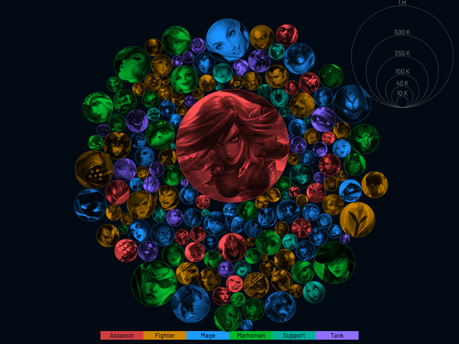
A use-case for this can be seen in the title image taken from my project at masterychart.com, which demonstrates how color filters can be used to visually group playable characters that belong to a common category.
To reach this goal, usually, when you're trying to overlay an image in HTML with a color, you can just make use of your trusty old background CSS property, which allows you to specify multiple attribute values to get a basic color overlay on top of an image:
background: linear-gradient(to top, #ff000044, #ff0000ff), url('your/image/url');When working with Scalable Vector Graphics (SVG), this will not work as the background property has no effect on SVG elements, which instead work with the fill property. For simple cases like a simple solid background color or a background image linked via URL, fill will work just the same. As soon as you'd like to use other properties such as gradients, their similarities quickly dwindle.
One possible way to combat this problem would be by layering a second, equally sized SVG element on top of the one containing the image and assigning it a transparent, colored background:
circle {
    fill: #ff0000;
    fill-opacity: 0.5;
}
This "hack" might be just enough for simple cases with few, static elements, but doesn't hit the mark for my use-case:
Mastery Chart's core visualization, a bubble chart (such as the one displayed in the header) can hold over 150 separate circle SVG elements generated with D3.js that can be moved by changing the grouping type or manually by dragging them. The bubbles will interact with each other while being moved. Each of these bubbles contains an image. For a mobile browser, this can be quite a heavy task that will make the site unresponsive and worsen the user experience.
A different, lightweight solution is needed.
Our savior will be the SVG attribute filter, which supports all common CSS filters. To start, we can apply a sepia(1) filter, which brings us to a color filtered image in a predictable color range between yellow and brown. This allows us to manipulate the color with other filters like hue-rotate, brightness and saturate.

Here's how to achieve a similar effect :
- Correct the hue by substracting 30° to 45° from the original value
- The exact value needs fine-tuning and depends on the wanted color
- If the result is negative, we add 360° since hue is circular in this context
- e.g. for red you'd calculate
0° - 35° + 360° = 325°and fine-tune from there
- Lower brightness to 45% to flatten lightness and to "color in" light spots
- Crank saturation up to 500% to counter the sepia's low saturation and the lowered brightness
The resulting CSS-filtered element will be structured somewhat like this:
<circle fill="url('your/image/url')" filter="sepia(1) hue-rotate(325deg) brightness(0.45) saturate(5);"></circle>That's about it, good luck with your project!